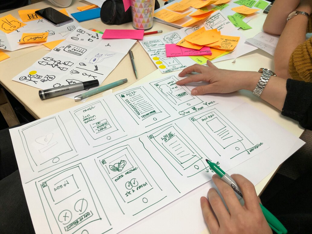
The world of web design is constantly changing and studying SAE’s Web Development Degree is a great way of staying on top of the latest trends and developments in the sector. By taking on the course, you will be able to hone your skills in creative environments alongside collaborating with peers who can inform and inspire you. Get in contact to find out more about the course and read our new blog on the best ways to make your website accessible for all…
Why is designing for all a must in the web world?
Inclusivity is a key ambition for web designers when constructing a business website or effective online presence. Our blog will explore this concept and latest inclusive design practices that uphold equality and enhance the experience for all web users, no matter what their abilities.
The Foundation of Inclusivity: Understanding Web Accessibility
Web accessibility refers to the practice of designing and developing websites, tools, and technologies so all users, including those with disabilities, can access and use them.
Web accessibility is more than just a box-ticking exercise for compliance or avoiding legal issues. It’s about recognising the diversity of users – from those with visual and hearing impairments to those with broken limbs.
Understanding and empathising with these diverse user scenarios is the first step towards creating more accessible websites and inclusive online environments.
How do we go about this? Well, continuous evaluation and testing are crucial in the development of websites to achieve maximum accessibility. The digital world is ever-evolving and so are user needs and priorities. Some of the most effective approaches to stay on top of this include:
- Regular audits
- User interviews
- Website testing
All of these approaches help uncover any pain points and ensure websites meet the highest accessibility standards.
But what happens if we ignore web accessibility? Well, the consequences can range from excluding a large user-base to even legal repercussions.
Inclusive design is not just an ethical obligation; it’s also a business imperative. The goal is to enable full digital participation for everyone, irrespective of their abilities.
The Cornerstones of Accessible Design
Building an accessible website is about understanding and applying the key principles of web accessibility. The Web Content Accessibility Guidelines (WCAG) outlines four of them:
-
- Perceivable
- Operable
- Understandable
- Robust
Perceivability ensures the presentation of information and interface components in a way that users can easily grasp. This means providing alt text for images, using colour contrast effectively, and making sure content is readable for visually impaired users and screen readers alike.
Operability is all about ensuring users can navigate and interact with a website. This includes keyboard accessibility, touch accessibility, and making sure navigation menus are easy to use.
Understandability aims to make web content and the user interface comprehensible to all users. This involves using plain language, clear instructions, and consistent navigation.
Robustness emphasises compatibility with current and future user agents, including assistive technologies. It’s about ensuring that as technology evolves, accessibility remains a priority.
Crafting Content for Maximum Accessibility

The creation of accessible content is not just a technical task.
It’s also about making the content itself easy to understand and consume. Using plain language, clear headings, and providing appropriate alt text for images are some ways to ensure content accessibility. Doing this benefits everyone, especially those with cognitive disabilities or those dealing with unfamiliar topics or languages.
Alt text, in particular, plays a vital role in web accessibility. It provides a description of images for people using screen readers or those who can’t see the pictures. But that’s not all! Alt text also helps improve your website’s SEO by giving search engines more information about the image content. So creating this is a win-win!
Remember that creating accessible content does not mean simplifying the information. It’s about making this accessible and easy to understand for everyone, ensuring no one is left out of the digital world.
Navigating the Path of Accessibility: Keyboard and Touch
Navigating a website using a mouse or a touch screen isn’t an option for everyone. Some users might have motor disabilities or other conditions that limit their use of traditional navigation methods. This is where keyboard navigation comes in. It’s all about ensuring users can navigate and interact with the website using just the keyboard.
Smooth keyboard navigation necessitates careful design and correct coding techniques. It involves creating big, easy-to-click buttons, providing skip links, and organising interactive elements in a logical order. These considerations can make a huge difference for users with mobility impairments and enhance the overall user experience.
Another important aspect of web accessibility is touch accessibility. With the increasing use of mobile devices, it’s essential to ensure that touch screen interfaces are accessible and easy to use. This requires responsive design that adapts to different screen sizes and available space on devices to make navigation as easy as possible.
Visual Design and Accessibility

Creating accessible websites heavily relies on visual design.
Elements such as colour contrast, font choices, and layout can significantly impact a user’s experience, especially for those with visual impairments. Web designers play a crucial role in ensuring enough colour contrast, for instance, which helps users distinguish between different elements on the page and guarantees easy readability.
A colour contrast ratio of at least 4.5:1 is recommended for web accessibility. Similarly, choices around font type and size can also impact the user experience. Avoiding small or decorative fonts that can be difficult for users with visual impairments to read can significantly improve accessibility too.
Screen readers are another essential tool for users with visual impairments. These assistive technologies convert text and image content into speech or braille output, helping users to understand what’s on the website. Ensuring compatibility with screen readers is, therefore, a key aspect of visual design for accessibility.
Auditory and Cognitive Accessibility: Beyond the Visual

Accessibility extends beyond just the website’s visual elements. Designing for users with hearing impairments and cognitive disabilities is equally important. Multimedia content, for instance, should include closed captions or sign language interpretation to enhance accessibility.
Transcripts for multimedia content should be accurate and descriptive, containing important audio cues and sound effects. They should also describe visuals and sounds for users who may not be able to see or hear them.
For users with cognitive disabilities, web design should:
- Be simple
- Use clear language
- Provide visual cues
- Have consistent navigation
- Include clear instructions
- Offer customization options
These elements can significantly enhance their browsing experience.
Responsive and Assistive Technology-Friendly Design
Given today’s diverse digital landscape, it is vital to ensure compatibility with various browsers, devices, and assistive technologies. Users access the web in myriad ways, using different devices and tools. Ensuring that your website works seamlessly across a multitude of platforms is a key aspect of web accessibility.
Assistive technologies, such as screen readers, alternative keyboards, and braille displays, help users with disabilities navigate the digital world. Websites should be designed to be compatible with these technologies, using tools like ARIA roles to give web elements more meaning.
Finally, responsive design is key to ensuring a seamless user experience across different devices. By adapting the layout to fit different screen sizes and available space, we can make it easier for users with disabilities or limited dexterity to navigate and use the website.
Legal Requirements and Ethical Considerations in Web Accessibility
Web accessibility is both an ethical obligation and a legal requirement. In many countries, including the United States, website accessibility is required to meet specific standards, such as the WCAG 2.0 AA standards outlined in Section 508. Non-compliance can lead to legal challenges and potential penalties.
These laws and regulations aim to guarantee equal access to web content for all users and to prevent discrimination against individuals with disabilities. They serve as a reminder that the internet should be a place where everyone can participate fully.
Each country may have its own laws and guidelines around web accessibility. Regardless, the goal remains the same – to create a digital world that is inclusive and accessible to all.
Summary
Web accessibility is not a one-time effort; it’s an ongoing commitment to inclusivity. It’s about recognising the diversity of our users and ensuring everyone can fully participate in the digital world. From understanding the foundations of web accessibility to applying the principles of accessible design, we’ve explored various facets of creating accessible websites.
Remember, an accessible website is not just beneficial for users with disabilities; it improves the user experience for everyone.
Frequently Asked Questions
How do you design web accessibility?
When designing web accessibility, consider using proper alt text for images, headings, accessible PDFs, ARIA landmarks, and form field labels.
What is universal design accessibility?
Universal design accessibility means designing products and environments to be usable by all people without the need for adaptation or specialised design. It aims to maximise accessibility for everyone.
What are the basic principles of web accessibility?
Web accessibility is guided by the principles of perceivable, operable, understandable, and robust (POUR), as outlined in the WCAG we’ve previously discussed. Following these principles is crucial for creating an accessible website.
Why is it important to design things that can be used by everyone?
Designing things that can be used by everyone is important because it leads to improved user experiences and creates greater innovation. By considering the diverse needs and abilities of all, universal design creates environments, services, and systems that benefit everyone.
How can we make our content more accessible?
To make your content more accessible, use plain language, clear headings, and provide appropriate alt text for images. This will help ensure that your content is accessible to a wider audience.
STUDY web design and development at SAE
If you want to work in web design, understand the latest technology and work out how to network and enhance a portfolio, then our Web Design and Development degree could be for you.
Our facilities and expert tutors are well placed to give your career the best possible start in this fast-paced and dynamic industry.


